Need Help?
Please leave your contact information to get our latest catalog
Get In Touch Now >


Author:SOP Work Pods Manufacturer TIME:2026-08-31
Office phone booth design is often treated as a finish-selection exercise, but a useful workplace design brief has to coordinate appearance, acoustic intent, sight lines, equipment, access, cleaning, and future replacement. For an Austria-oriented office project, the buyer may want the booth to feel like part of the interior rather than a piece of equipment placed beside a desk. That ambition is reasonable, provided the visual decision does not hide the practical conditions that make the booth usable.
This article is a planning and supplier-review framework. It is not a named Austrian customer case, a local approval, a measured acoustic result, or a guarantee of compliance. The project team should confirm the actual building, fire, accessibility, electrical, ventilation, property, and workplace conditions with the responsible local professionals. The purpose is to turn a design idea into a controlled specification that can be compared, built, inspected, and maintained.
Begin with the feeling the office should create, then convert that feeling into decisions that can be checked. “Calm,” “premium,” “warm,” or “consistent with the reception area” are useful starting descriptions, but they are not enough for a quotation. Add the intended user, likely call length, position in the floor plan, number of booths, expected device, privacy objective, cleaning method, and maintenance owner. The result is a design brief that gives the supplier something more precise than a mood reference.
Separate fixed requirements from choices. A clear route, stable door operation, usable seat, adequate work surface, suitable lighting, access to power, and a defined service route may be fixed requirements. Exterior colour, fabric family, trim, logo treatment, and decorative accessories may be choices. This separation helps the team understand which design changes affect daily performance and which mainly affect visual identity.
For an Austrian office, the building context may vary greatly between a compact city workplace, a shared business centre, a headquarters refurbishment, and a flexible floor used by several companies. Do not assume that one visual treatment suits every setting. Record the surrounding materials, daylight direction, corridor traffic, ceiling condition, and the level of visual prominence the workplace owner actually wants.
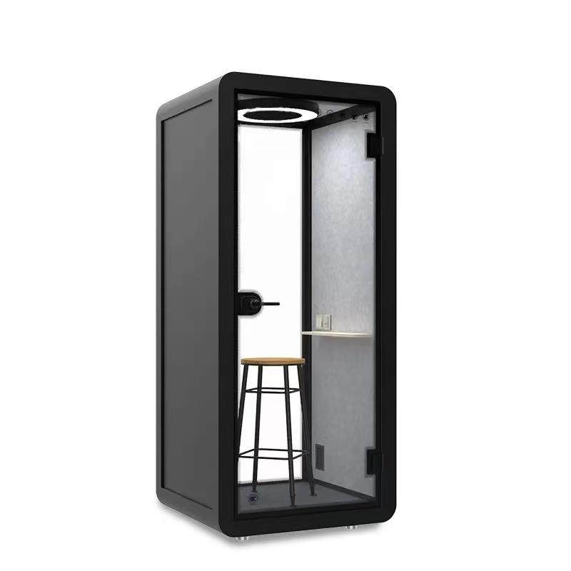
A booth can belong to a workplace through colour, material, proportion, signage, and placement. It does not need a heavy graphic treatment to become recognizable. Start with the office palette and select one or two controlled finish directions. A muted panel colour may connect the booth to the interior, while a contrasting edge can help users see the door and understand where to enter. The design should support orientation rather than turn the entrance into a visual obstacle.
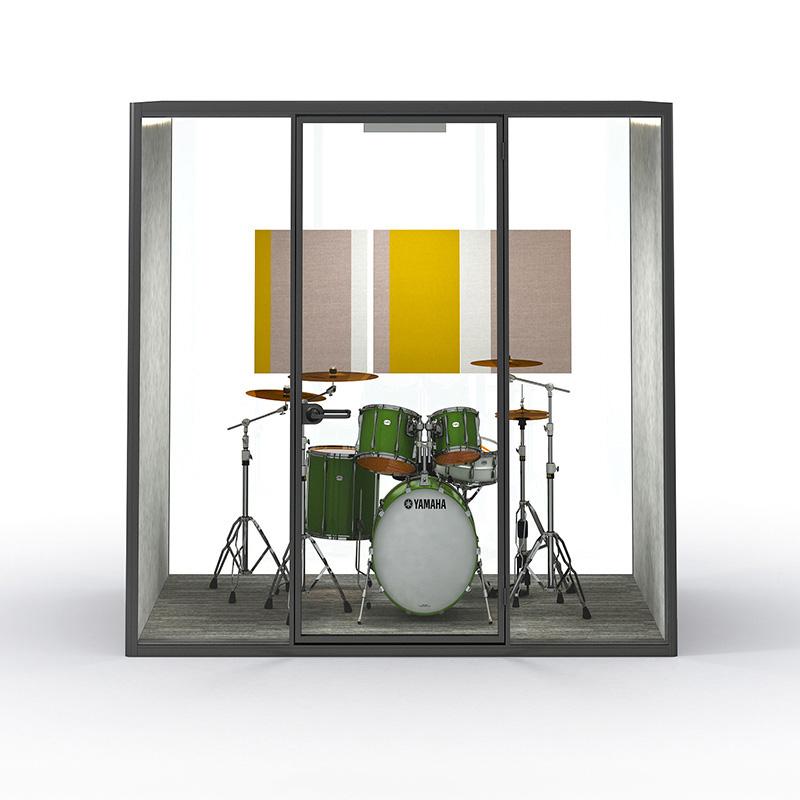
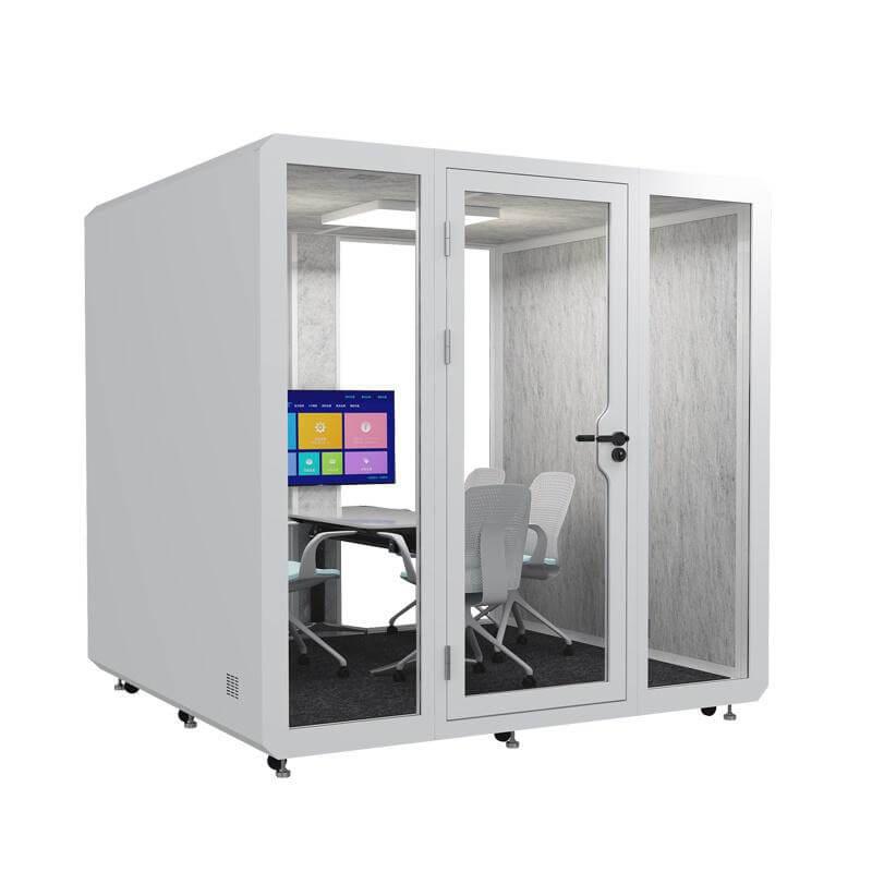
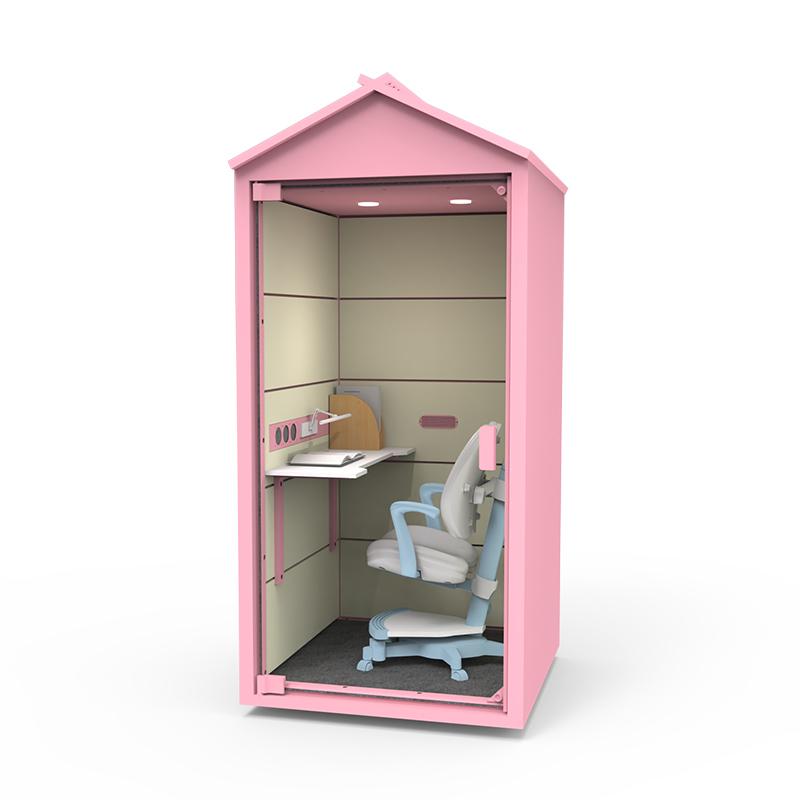
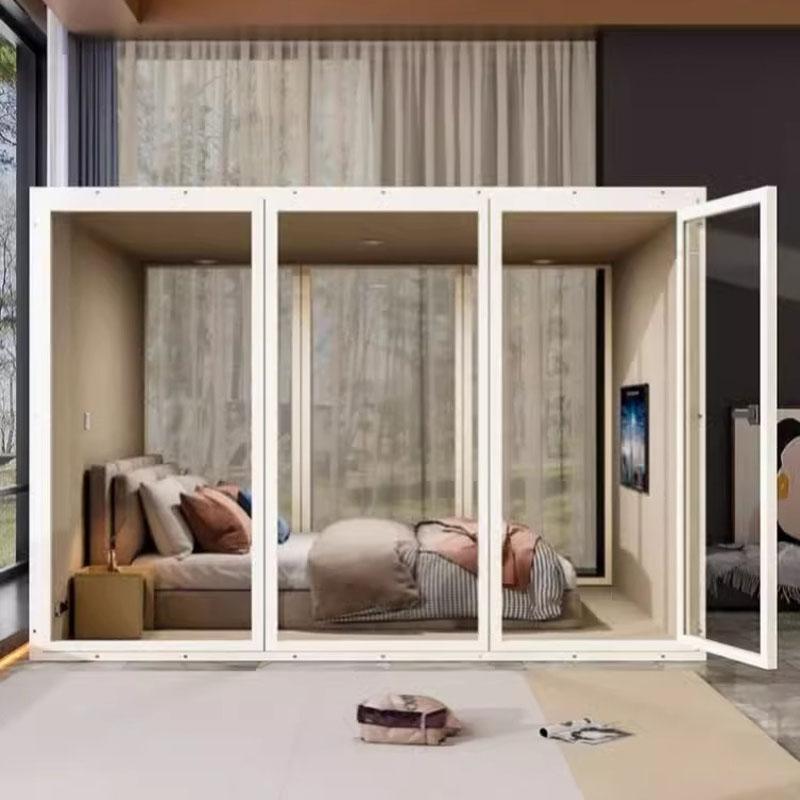
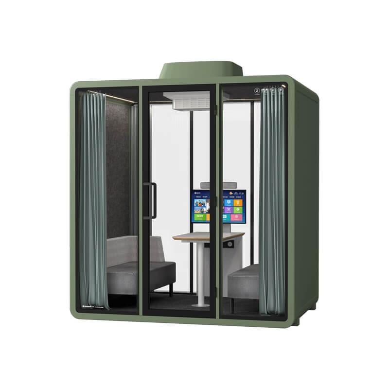
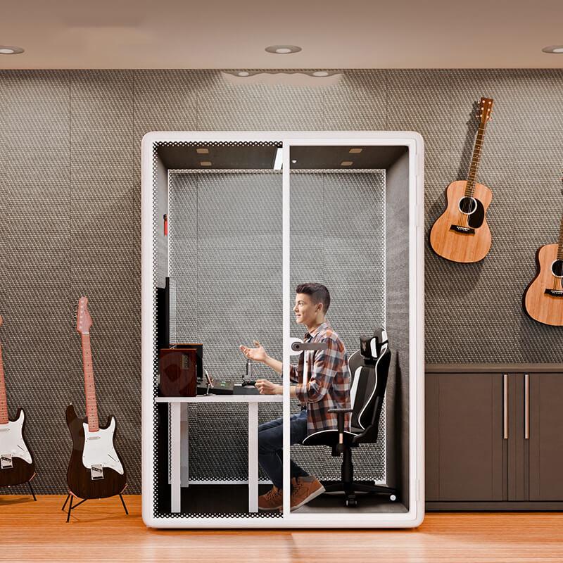
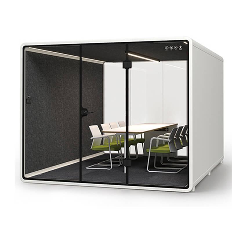
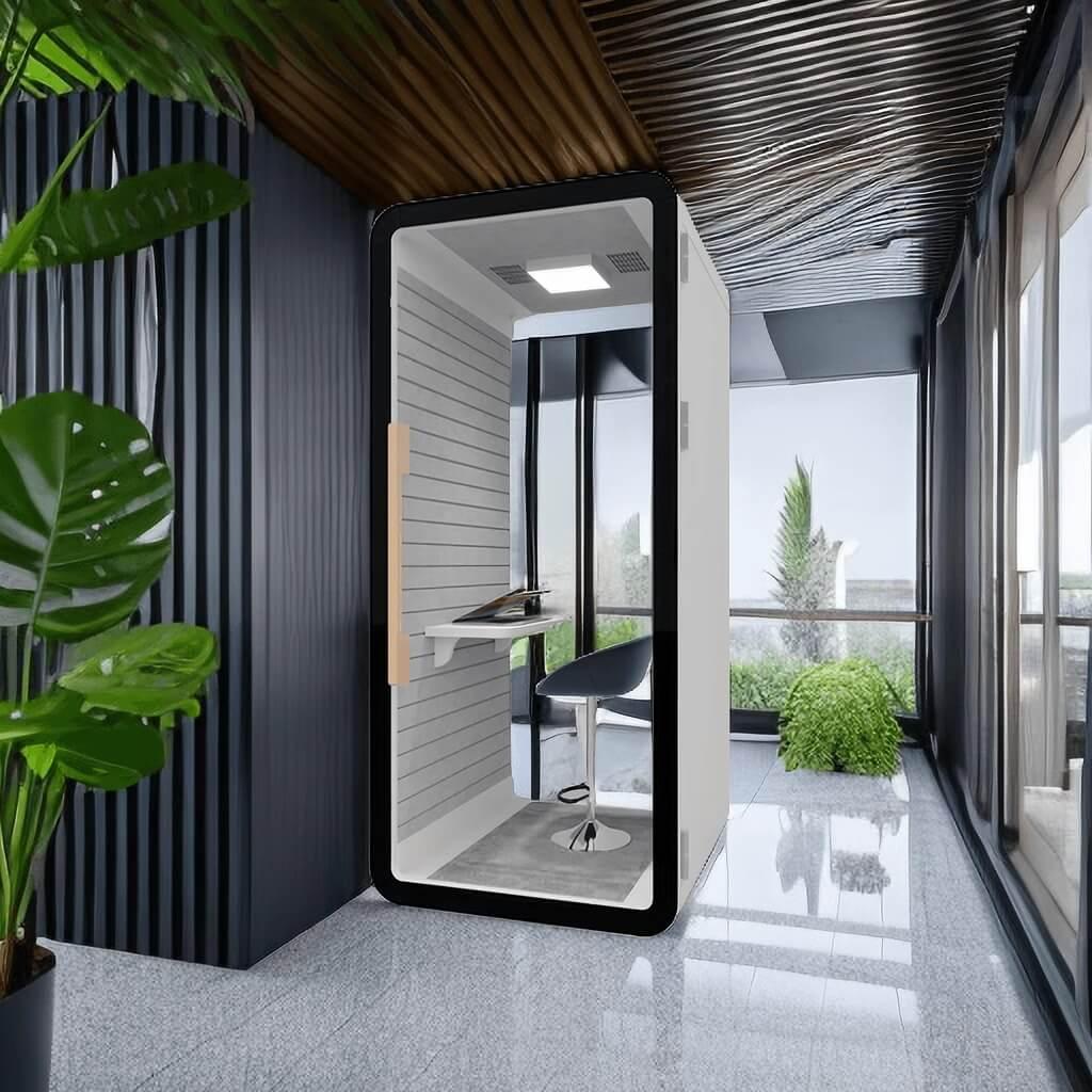
Keep the product boundary visible in the design review. The office phone booth range can be used to compare the relevant product family, but the design board should identify which model, panel, glass, furniture, light, ventilation, and accessory assumptions are included. A styled rendering can show an attractive arrangement that is not part of the actual offer. Every approved image should therefore be labelled as a reference, an option, or a confirmed configuration.
Consider repetition across a floor. If several booths are installed, a coordinated family may be easier to maintain than a collection of unrelated finishes. At the same time, identical placement can create a row that feels institutional or makes every entry face the same busy route. Test the composition from the main approach, from seated desks, and from the normal visitor path before treating a single perspective image as the final design.
Glass is a design element and a privacy decision at the same time. It affects daylight, visual connection, supervision, reflection, and the amount of information that can be seen by people passing outside. Ask what should be visible from the corridor and what should remain discreet. The height of a frosted band, the position of a handle, the direction of the door swing, and the angle of a screen can change the user experience more than a colour sample does.
Map the important sight lines on the floor plan. Mark the normal approach, nearby desks, meeting areas, reception points, and any camera or display position. Then review a user standing, seated, entering, and leaving. A design that looks balanced from the front may expose a screen when viewed diagonally. The record should describe the sight line and the design response without claiming that a film or panel automatically solves every privacy concern.
Door movement also deserves a practical test. Allow for bags, coats, laptop cases, and ordinary traffic. Confirm that the handle can be used comfortably and that the closing action is understood. If the booth is shared, a visible availability signal or simple sign can reduce interruptions. These small details make the design legible, which is more valuable than decoration that users do not know how to operate.
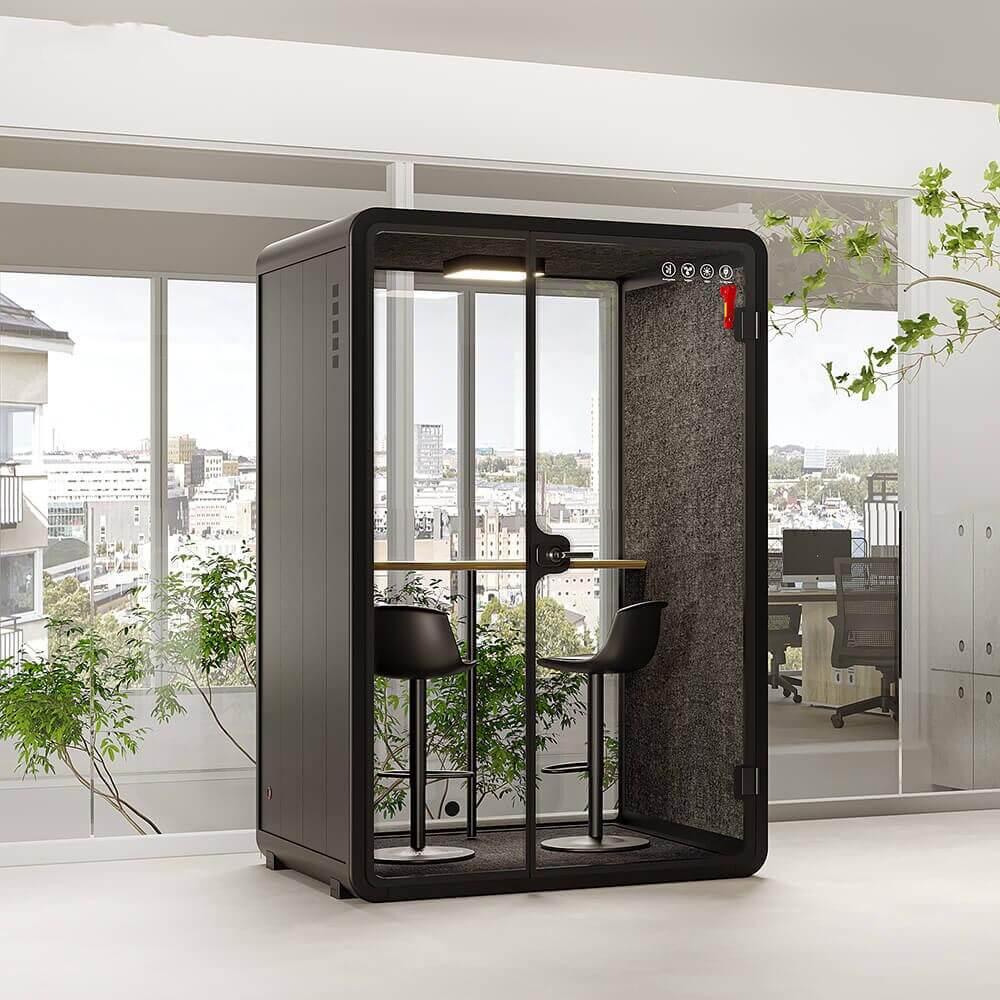
Finish decisions should survive ordinary work rather than only a showroom inspection. Review how fingerprints, dust, drinks, bags, chair movement, and frequent hand contact will appear. Ask which surfaces can be cleaned with the workplace method, which products must be avoided, and whether a damaged panel or trim can be replaced without dismantling the entire booth. A beautiful material that creates a difficult maintenance routine may produce a poor long-term result.
Use a sample board with a use note beside every item. Record colour, texture, cleaning instruction, replacement assumption, batch or finish reference, and the party responsible for approval. Do not approve a digital colour alone when the surrounding lighting is important. Compare samples under the office's general light and near daylight if the booth sits beside a window.
Consider repair visibility. If a component is replaced later, will the new part match the original finish? Does the proposed material have a defined supply route? The answer may influence whether the project chooses a distinctive custom finish or a stable standard option. The design owner should understand this trade-off before the product is ordered, not after a maintenance request arrives.
Video calls make a phone booth design more demanding. The user needs a usable face position, a camera angle that does not show an unintended route, a background that is not distracting, and enough light to avoid a dark face or strong reflection. Test the real laptop, headset, monitor, and charger position. A generic image cannot establish whether a particular device will fit or whether the cable will cross the user's movement path.
Lighting should be reviewed from the user's normal seated and standing positions. Check glare on the screen, reflection in the glass, the effect of a bright corridor, and the ability to adjust or maintain the light. If the booth is used for calls with external visitors, the visual setting becomes part of the company's presentation. That does not mean the interior must look theatrical; it means the chosen materials should remain calm and legible through a camera.
Coordinate technology with the service boundary. Identify who supplies the camera, who installs the mounting, who provides the network, and who handles troubleshooting. The booth design can support good placement, but it should not imply that a supplier controls the customer's managed devices or information-security policy. Keep those responsibilities explicit in the approval pack.
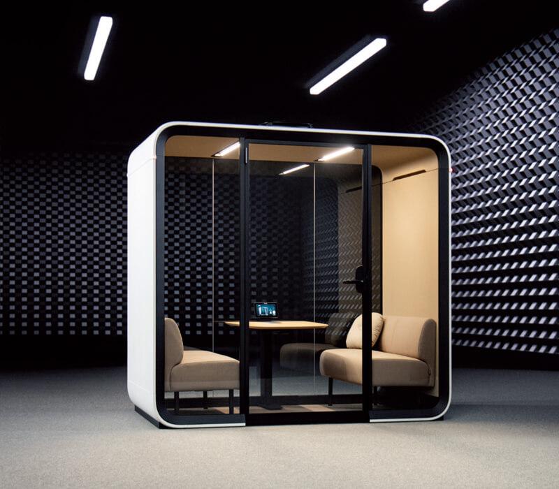
Design review should include more than the booth footprint. Draw the approach, entry, turning space, nearby furniture, emergency movement, cleaning route, and access to service points. Consider a person carrying a laptop, a visitor who has never used the booth, and a facilities worker carrying cleaning supplies. If every movement depends on another desk being empty, the design is too fragile for a busy office.
Confirm the applicable accessibility and building requirements for the real site with qualified local professionals. Product dimensions can support a review, but they do not replace a site-specific assessment. Check the door effort, handle position, threshold, visibility, seating arrangement, controls, signage, and the route to the booth. Avoid describing a generic configuration as universally suitable.
Circulation also influences visual identity. A booth placed at the end of a corridor may act as a quiet destination. One placed in the centre of an open floor may need a clearer front, softer edge, or more deliberate orientation. Use a scaled plan and a simple walking test before approving a design that is based only on a front elevation.
When the team has two or three visual directions, compare them through the same criteria. This prevents the loudest preference from deciding the project without considering daily use. Score appearance only as one part of the review. Include cleaning, repair, sight lines, device use, access, surrounding circulation, procurement certainty, and the ability to repeat the design in another room.
| Decision criterion | What to inspect | Evidence before approval |
|---|---|---|
| Interior fit | Does the finish sit comfortably beside existing floor, wall, and furniture materials? | Physical samples under project lighting |
| User clarity | Can a first-time user see the entry, handle, seat, and working position? | Scaled plan and movement walkthrough |
| Video-call use | Are face light, camera angle, screen reflection, and background acceptable? | Test with the intended device |
| Maintenance | Can surfaces be cleaned and damaged parts be replaced without uncertain scope? | Finish schedule and service response |
| Repeatability | Can the same design be procured and maintained across other rooms? | Controlled model and option record |
Keep comments tied to evidence. “This feels more premium” can remain a useful preference, but it should sit beside a reason such as “the darker panel hides routine marks” or “the contrasting edge makes the handle easier to find.” A documented reason is easier to revisit when budget, availability, or a later room changes the design.
The approval pack should include the floor plan, elevations or configuration drawing, finish board, glass and door schedule, furniture list, lighting and ventilation assumptions, technology responsibilities, cleaning notes, maintenance route, delivery constraints, and the decision matrix. Mark every item as confirmed, selected option, buyer supply, supplier supply, or open question. This prevents a concept image from silently becoming a commercial promise.
Use revision control. A changed handle, panel, colour, door position, or camera shelf can affect both appearance and operation. Put the revision number and approval date on the drawing, quotation reference, finish schedule, and image set. Remove superseded files from the active handover folder or mark them clearly so the installation team does not work from a beautiful but outdated picture.
At handover, inspect the actual booth against the approved pack. Check finish, glass, door, seals, furniture, lighting, ventilation, outlets, cables, device position, sight lines, and access. Run a normal call with the intended equipment, then record open points with an owner and date. A strong design is not finished when it is rendered; it is finished when the delivered arrangement is understandable, usable, and maintainable.
What should an office phone booth design brief contain?
Include intended users, call duration, privacy objective, location, device setup, access route, surrounding materials, finish direction, cleaning method, maintenance owner, and the responsibilities that remain with the buyer or building team.
How can a booth match an Austrian office interior?
Start with the existing workplace palette and choose controlled finish options, then test the booth in the real circulation and lighting context. A visual match should support entry, privacy, cleaning, and future repair.
Does more glass always make a phone booth better?
No. Glass affects daylight and supervision, but it also changes reflection and visual exposure. Review the actual sight lines, door position, screen angle, and the privacy objective before selecting the amount and treatment of glass.
Should technology be included in the design approval?
Yes. Camera position, light, screen reflection, charger access, cable routing, network responsibility, and service access can change the design. Confirm which devices are included and who installs or supports them.
How is the design checked after installation?
Compare the delivered booth with the controlled drawing and finish schedule, then test entry, seating, device connection, lighting, door operation, sight lines, cleaning, and the normal call routine. Record any correction before final acceptance.
Good office phone booth design connects the visual language of a workplace with the less visible work of privacy, access, technology, cleaning, service, and acceptance. The most attractive concept is only useful when users can understand it, operate it, and continue to use it after the first presentation photographs are gone.
For an Austria-oriented project, the practical next step is to create a constrained design brief, test glass and finish samples in the real setting, compare options through evidence, control every drawing and responsibility, and inspect the final booth against the approved pack. This process protects the design intention while keeping claims specific, reviewable, and appropriate to the actual site.

 Tel: +8613538031763
 Email: info@sopworkpod.com
 MP/WhatsApp: +8613538031763
 Manufacturer Address:Liucheng Lujiang District,Meixi Road,Nanan City,Fujian,China